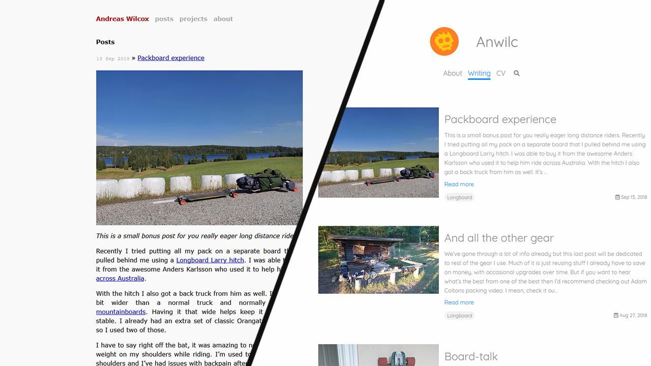
You might notice that things look a bit different here since last you visited. I decided to do a complete redesign of the website which got kicked off after I decided to finally register a name for my company in combination with me starting to look for new work. And now I will take you on a journey on what has changed while going through the thought and design process of this project.
But first…
Company name
I started my company in around the middle of 2016 and I always planned on figuring out a name and registering it. Well, turns out I never could settle on a name I liked. The problem was that I needed something that would both fit for releasing games under and also something for my consulting work.
I felt that if it was too silly then it looks bad on the consulting side while too serious and then it looks boring on the game side. After going through many different names I first decided on The Anwil; combining my first and last name while also referencing the creation aspect of an anvil.
But the name was too similar to another consulting company called Anvil so instead I added the c to the name and dropped the The before, creating a new word as my company name. Namely, Anwilc.
Logo
The logo had a similar issue as the name, it couldn’t be too playful while at the same time I didn’t want it to be boring. Here I was lucky and I didn’t have to go through a bunch of candidates.
I just happened to play the painting game Passpartout: The Starving Artist and with its limited tools and palette I created the cute skeleton character you see at the top of the page.
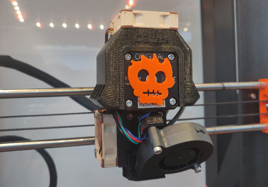
And I really liked it, with its pretty simple shape and only two colors. So I remade it using vector graphics with some slight tweaks and I was happy. So much that I printed it for use as a spinner for the extruder on my printer.

Website
As I mentioned earlier I was starting to look for new work, contacting new potential customers. But I kinda didn’t like giving out my website as a reference. Its original purpose, to host my blog and show off game projects I worked on, did not fit with what I wanted to present to my customers.
I must admit that I jumped the gun a few times and started coding while I was coming up the design which was a really bad idea. I really didn’t understand what the goal of the site really was, I hadn’t thought it through properly. So that is what I sat down and did.
The three main points of the site I decided upon was:
- To show a summary of what expertise I can offer
- My CV
- My blog
And regarding what I could bring to the table I condensed into three areas: programming, game development & 3D printing.
When it came to the design I wanted to keep the simplicity of the previous site with its single column. I’m not a huge fan of full width pages, I prefer effective use of negative space since for it me it both looks cleaner and calmer. After going over a lot of personal websites, company pages and existing themes to get inspired I decided to combine a few I liked.
- My friend Patrick Murphy’s portfolio site has a great way of focusing info for each of his projects and a very nice color scheme.
- Conor McCann’s site groups info nicely without too much noise. Only issue for me is that everything is on one page and doesn’t lend itself that well to having different pages in an easy to access way.
- Finally there’s Conor Patrick’s page, a good example of having different pages with a clean and spacious layout. Having a picture above the links looks good so I borrowed that for my design.
All of this I mocked up in Photoshop into pretty much what you see now. It didn’t take very long to do and it was a much faster way of mocking up the design instead of doing it in HTML & CSS like I did before.
For the old design I used Jekyll which is a static site generator, mostly for use with blogs. I still like Jekyll and didn’t want to remake the blog so I kept it but I decided that I should probably use a matching theme to help me out, one that would fit my design.
The one I liked the most was the TeXt Theme by Tian Qi since it has a really nice look to it and seemed very simple to use.
Starting out I knew that getting the theme to match my mockup would require quite a lot of modications. And I was correct. But I found that it was a good learning experience and I feel like I got a good grasp on the theme which will make future work much easier.
Encryption
Transitioning to HTTPs for an encrypted connection felt like a good idea and with Cloudflare it was really easy to setup as well. After adjusting my DNS to go through Cloudflare I noticed that Cloudflare’s DNS registry is cheaper than Hover’s that I was currently using so I transferred my domain to Cloudflare as well.
I’ve been using various different emails for years, each for a different purpose, but having a straight Gmail address doesn’t feel that professional. I noticed that Gmail allows using a custom domain if you pay 5 euros per month for a company account. I found that to be a totally reasonable fee for my usage.
Summary
It took longer than planned but now with the finished page I’m incredibly happy. The page fulfills the goals I set out and in my opinion it looks great. There’s one more thing I’ve worked on as part of this reimagining of my business but that’ll have to wait until next time.